VTEX Releases
2021 / 2022 end to end Product Design project. This case is still a work in progress.
About VTEX
VTEX is an e-commerce platform that assists well-known brands like Carrefour and Samsung in managing their entire digital business, from catalog management to storefront updates.
At VTEX platfom had an significant challenge of ensuring that clients updated their stores as frequently as needed without losing quality due to inconsistencies and small mistakes. So Releases was born.
The problem
Dozens of storefront updates go live daily, immediately after editing. Without any review or testing.
The marketing and business teams were responsible for implementing changes to adhere to certain decisions, but sometimes products went live with the wrong price or poorly set up promotions, which negatively impacted conversions, among other problems. As a result, our clients' businesses lost credibility.
The idea
A version management tool for non-technical users
Release would allow businesses to manage the updates and changes they make to their online store and to easily track and organize the different versions. This way, the non-technical users could always see when something would change and, with that, ensure that their website is always up-to-date and running smoothly.
Process overview
What is the client routine?
I had to undestand what motivated the changes, who was responsible for them and how often they happened.
How do other products solve this problem?
Mostly of the insights to design Releases came from Benchmark. I had to understand what to do or not.
What layout will help users undertand the concept?
Release managing was not trivial to the business users. I had to explore many layouts to decide.
The solutions I explored
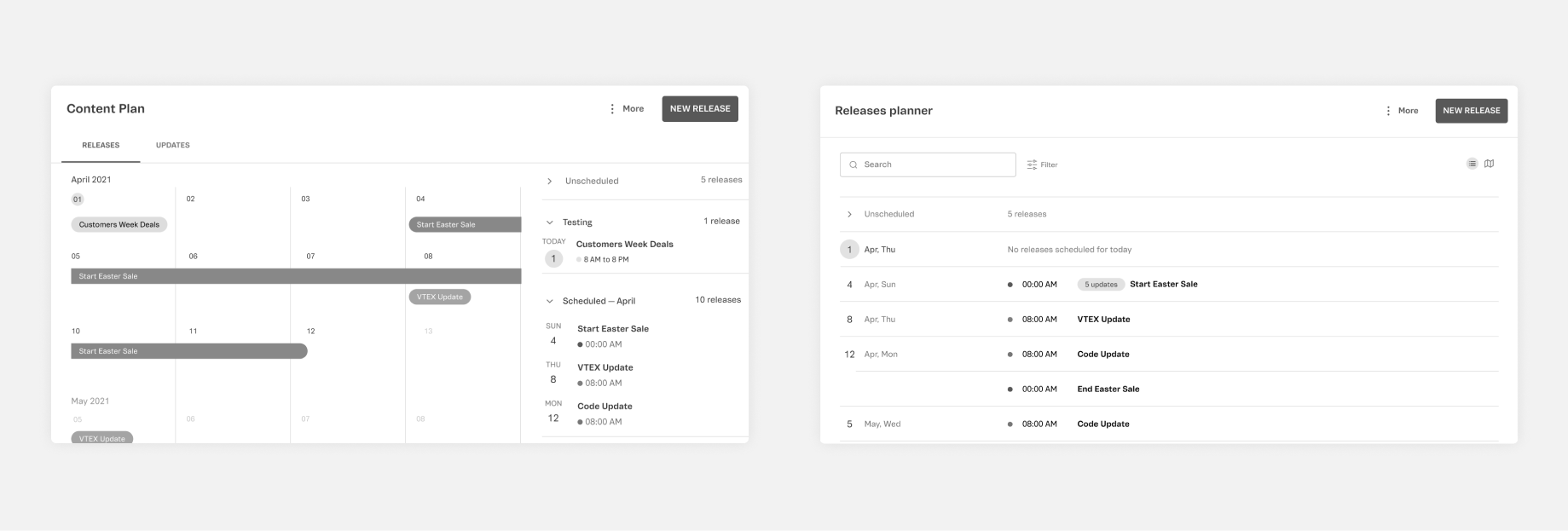
Timeline and Calendar view
In that circumstance, we were aiming for the ideal experience — to scope out an MVP.and I explored many different UIs, and picked one to test with users.
Conclusion
The ideal solution would be a calendar visualization. But we needed to take small steps.
Users always mentioned a calendar. They said would be the best way to visualize their releases. After all the user research, and gathering some feedback from the design team, I got to the calendar layout.
But implementing it would require too much effort. To solve that, I specified the implementation in stages, showing how we could get to the ideal scenario.
The MVP
Visual explorations and user research helped me to propose the scope
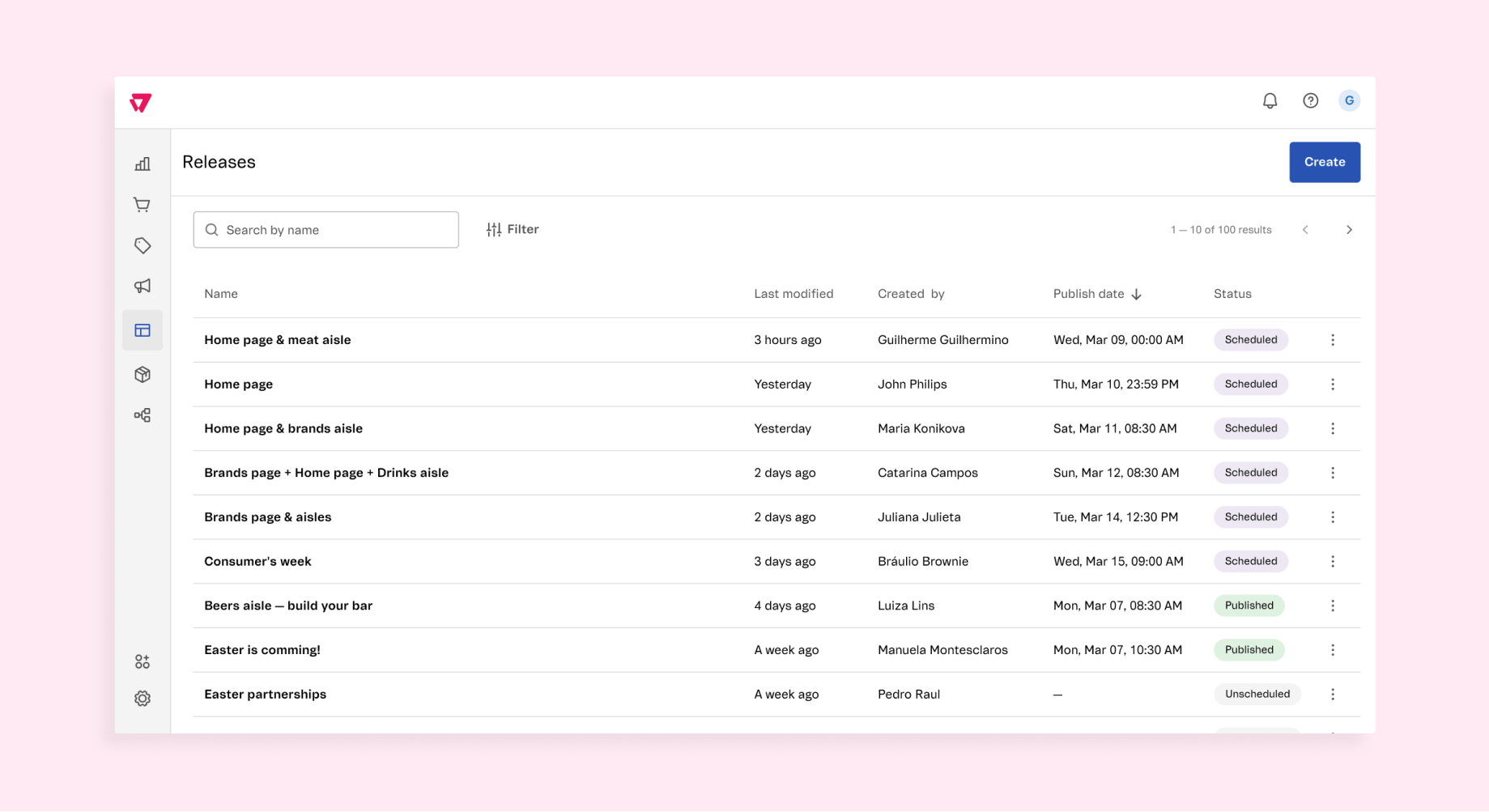
- Create releases (group of updates to go live)
- Schedule Releases
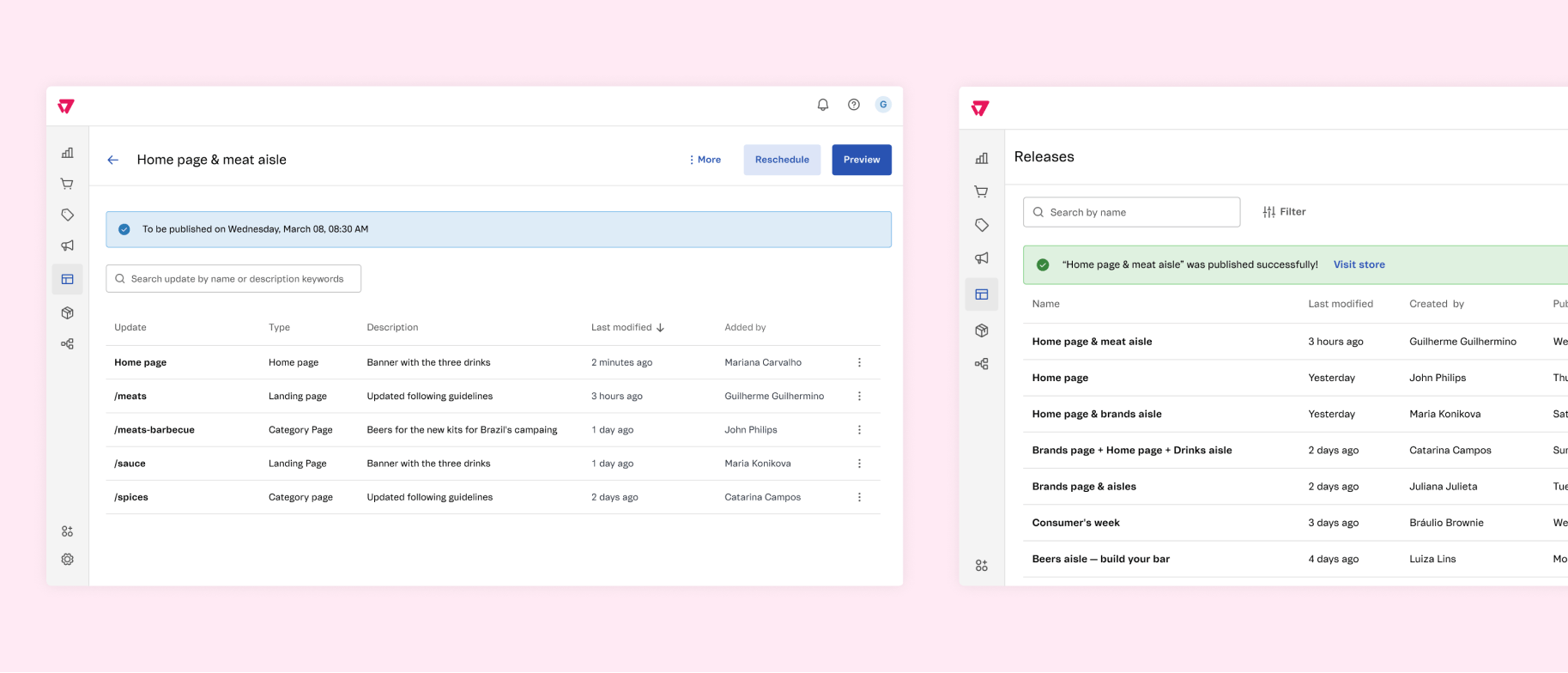
- Add updates from one other VTEX tool (the CMS)
- See the updates inside each release
The MVP scope based on user research:
Getting to the ideal
I prototyped how the product should be three months after the MVP release
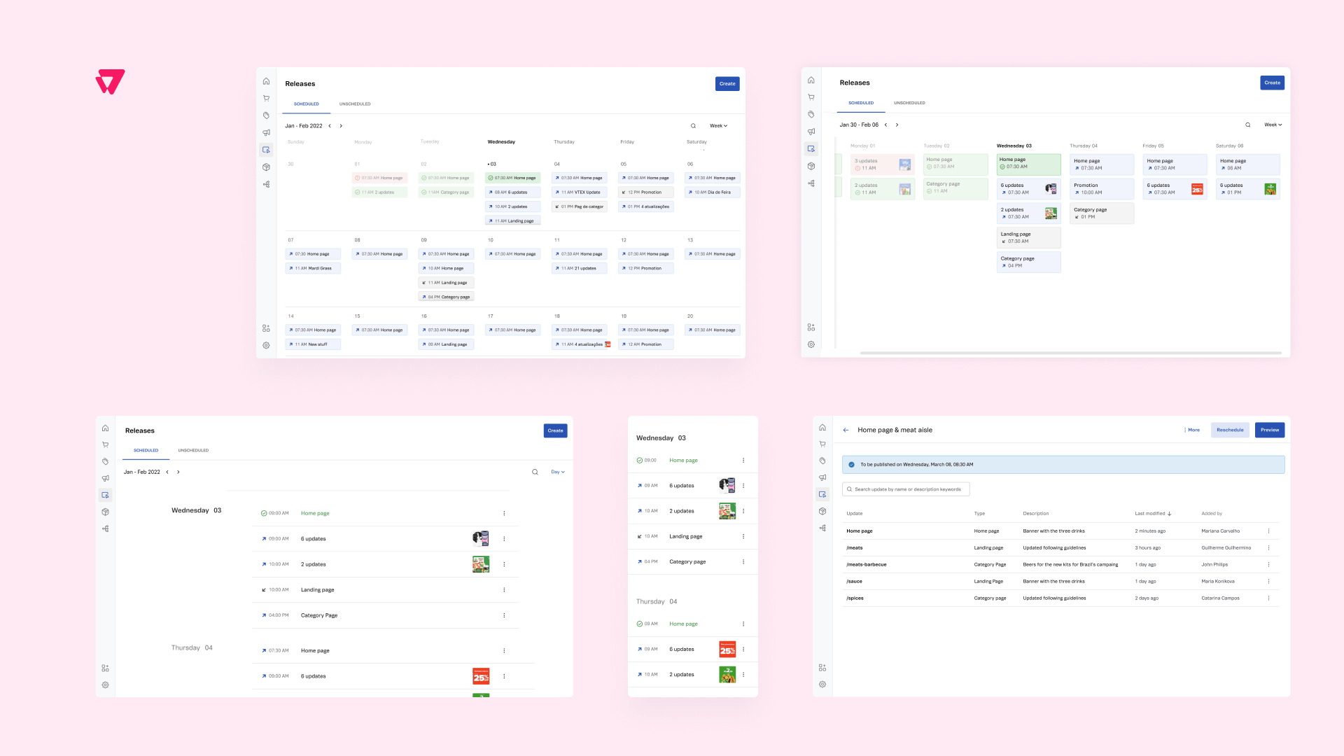
After a few months, users should be able to switch from a table visualization to a list visualization. This small step should already help them to better see what’s to come.
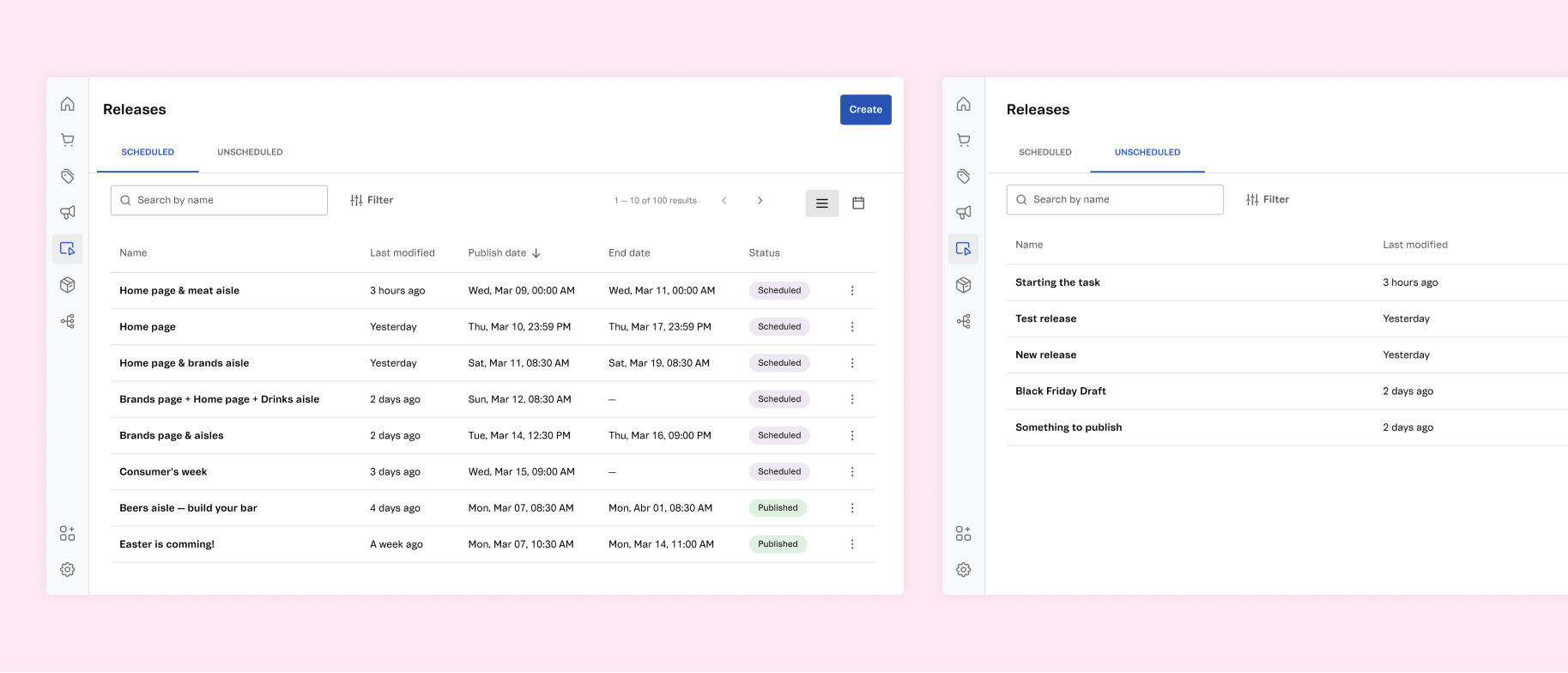
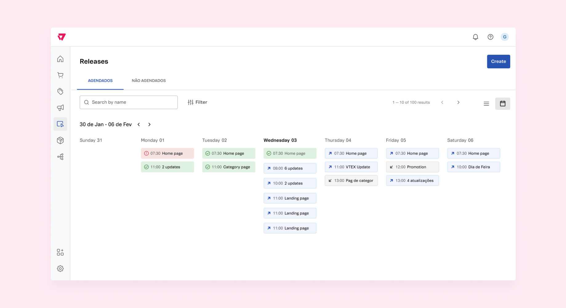
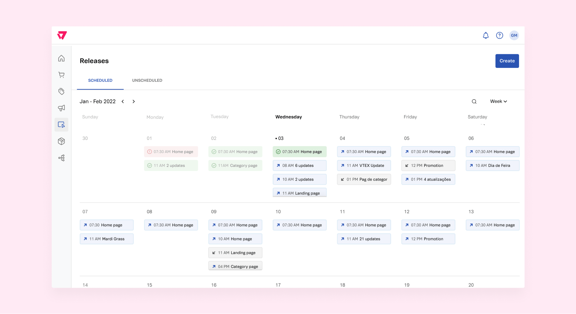
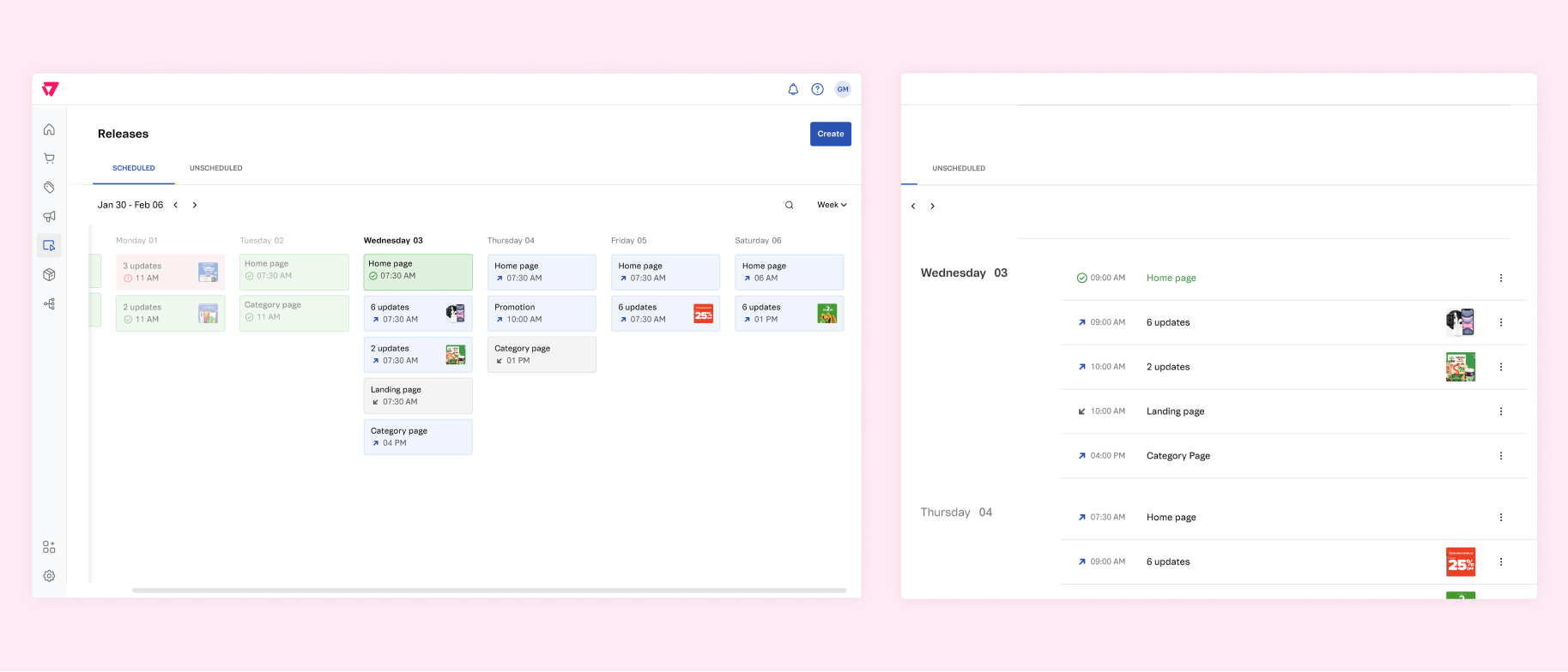
The ideal scenario would allow users to choose the best view for their use cases
Users would have monthly, weekly, and daily calendar views. It would be helpfull depending on the number os releases they’d do in a daily basis. If there are many releases, the day visualization should help them to have a clear understanding of what comes next.
Final thoughts
There are situations where we can create something that goes beyond the "as simple as possible". Releases were designed for a company that has an established Design System, which helped get the MVP live fast. But the table format didn't fit the user's expectations, and, as a designer, it was my job to scope the visual changes in a way it would fit the sprint, to deliver the best experience possible with one step after another.