Surfsapp
Project context
Planing a surf day can be fundamental to many surfers, with all experience levels, and when they check sea forecast usually will found complex data visualization.
More than forecasting, we need diagnoses
Beyond the graphic information overload, beginners may have interpretation problems with the information itself, see the content and ask: in what the wave speed influences when I'm surfing? With this, came the hypothesis: show the sea forecasting and explain it's components and how to use de data.
Public mapping
To learn the mental model of our target market and ensure product and communication consistency I applied a survey and a card sorting study. With the first, I intended to have some visibility of what was the hardest information to read and with the second, I would create the information architecture of the minimum product to deliver value.
Our surfers
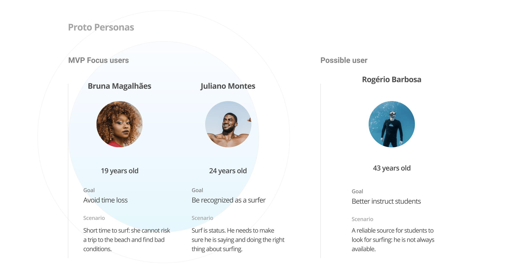
To the MVP, I choose to focus on surf beginners. Centered the content didactic on them, represented in this project by Bruna, our main proto-persona - we should ensure that she would never go to the beach without clear forecasting.
Besides the more explanatory vein of the content, intermediary and advanced surfers could gain time with a more simple forecast visualization. To represent them, we have our proto-persona Juliano.
Creating the product
Once I defined the problem was forecasting interpretation and learning for surf beginners, I established three foundations:
- We'll tell only what is relevant to the decision to go or not to go surf;
- Insights matter more than charts;
- We'll avoid niche language and only use them when followed by the explanation of what they mean.
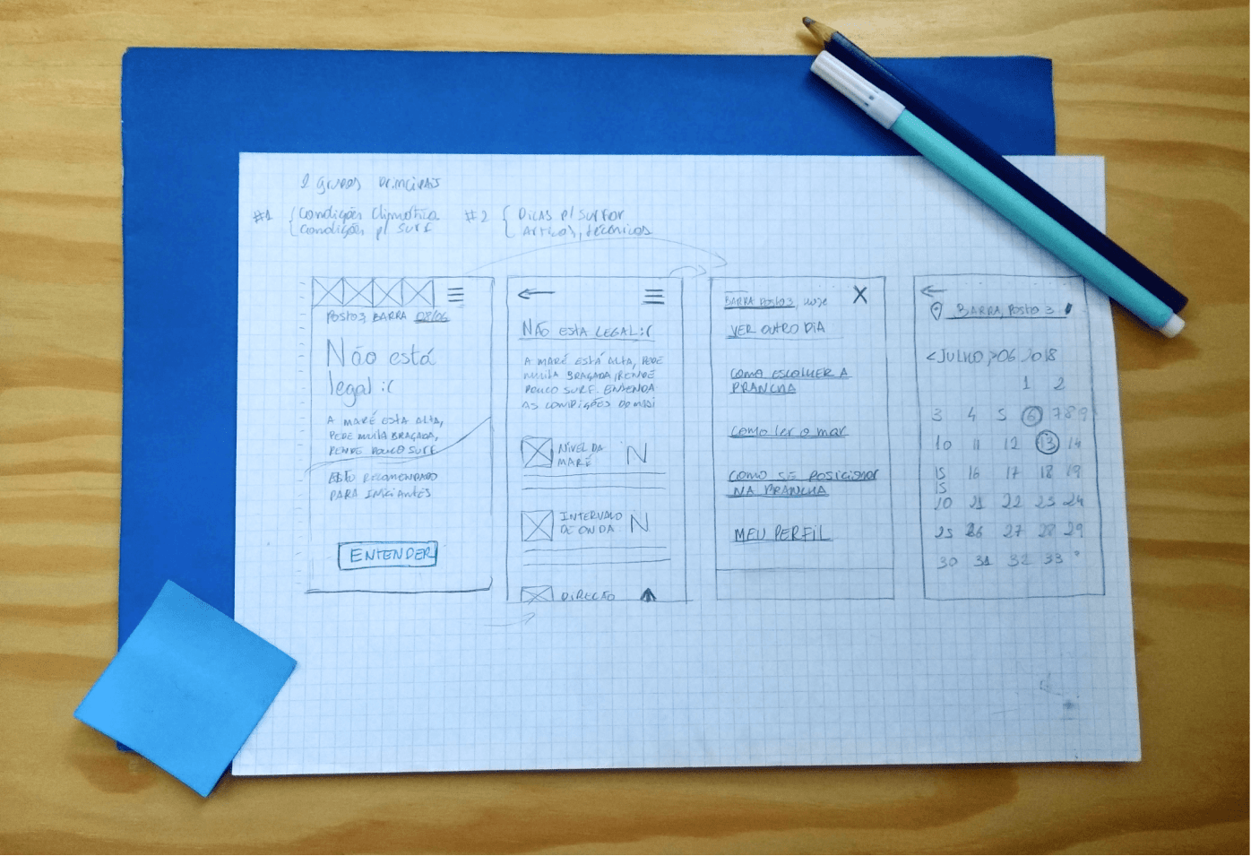
I started some flow and interface structure sketchs.
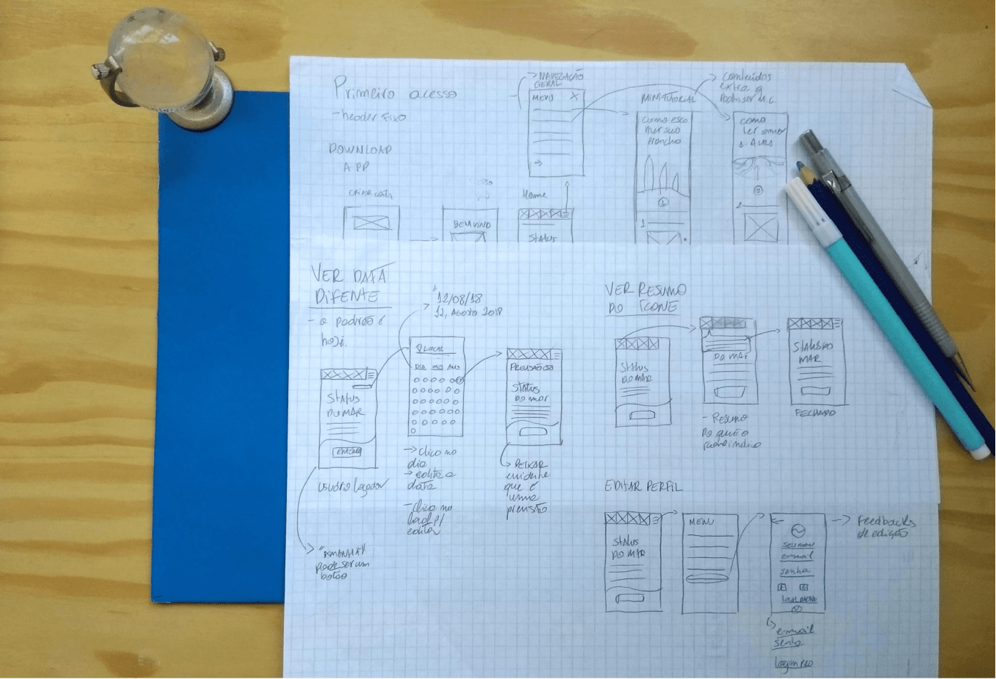
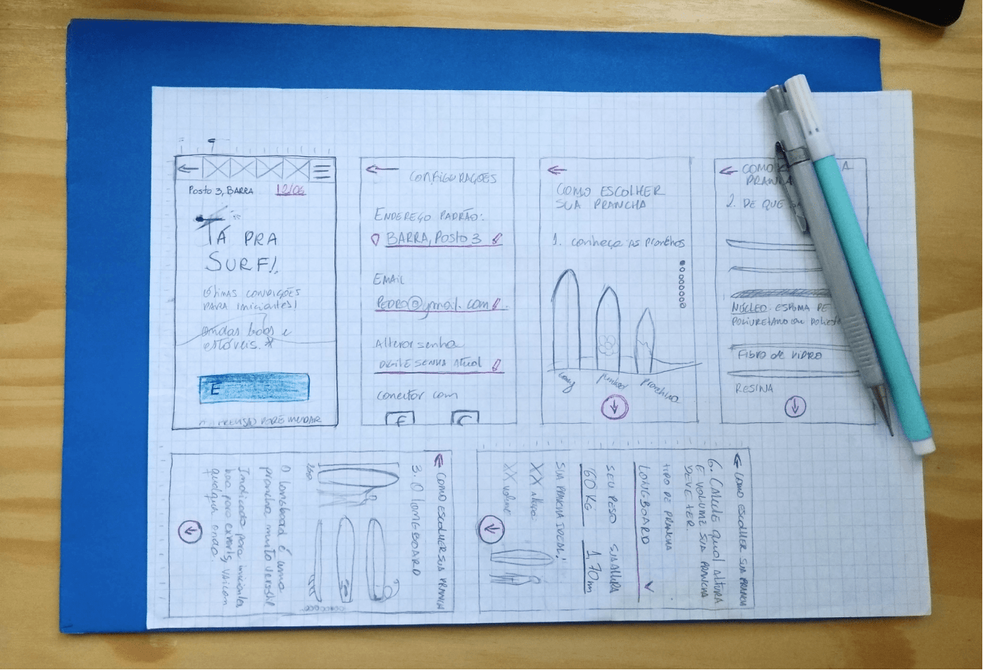
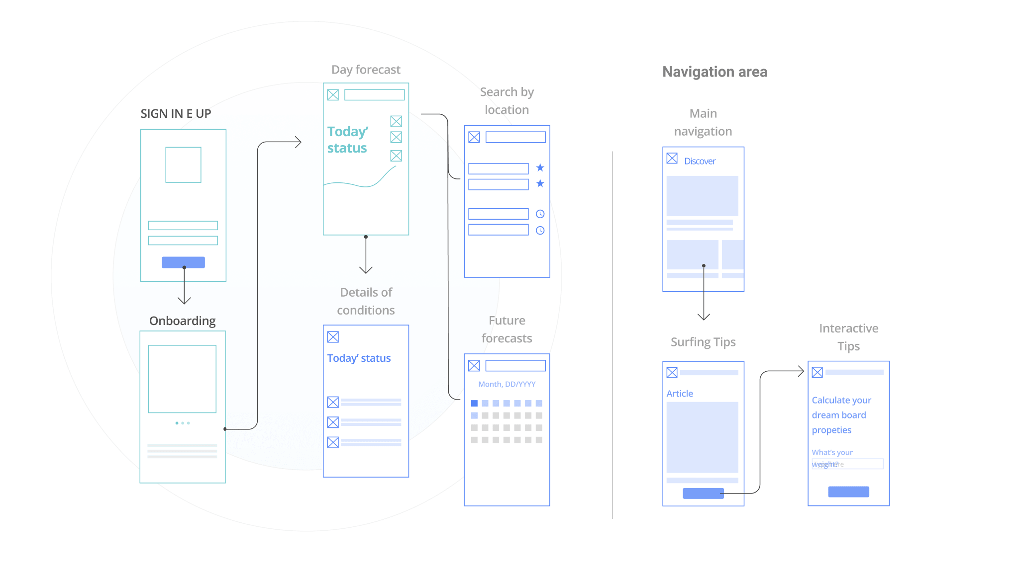
At the end of the drafting process, I came to a navigation architecture.
Identity and consistency
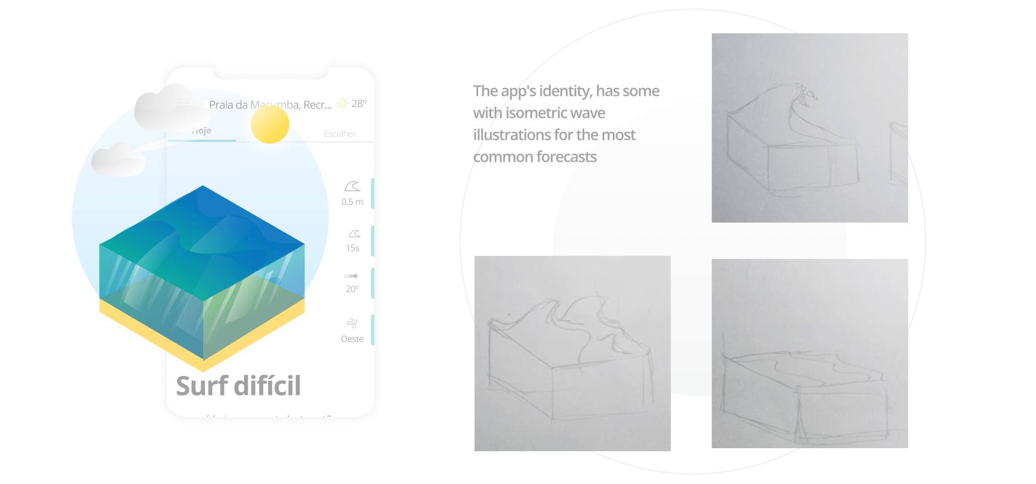
To compose the values and principles of the value propose I developed a few illustrations, to ensure visual identity.
The result
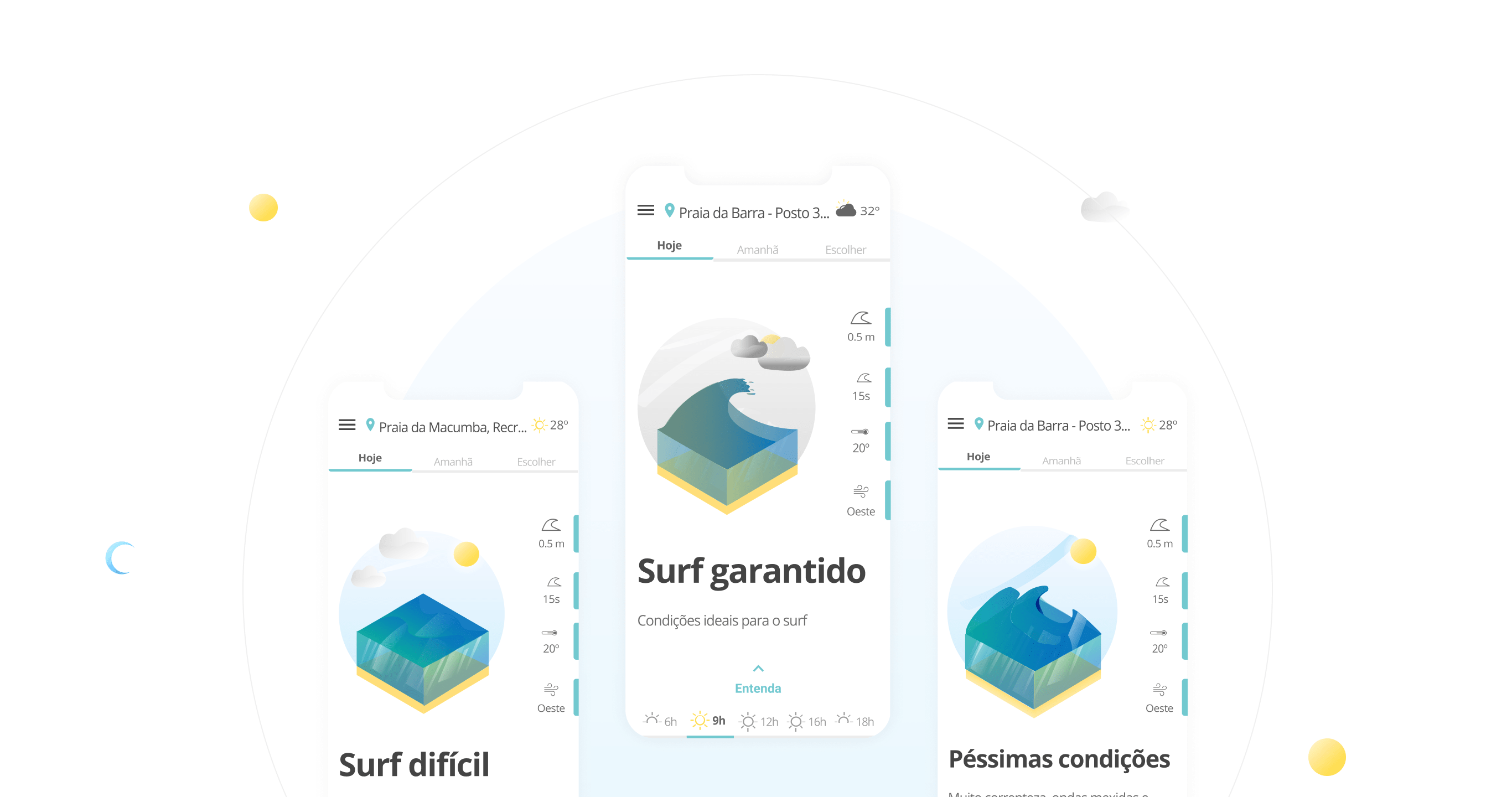
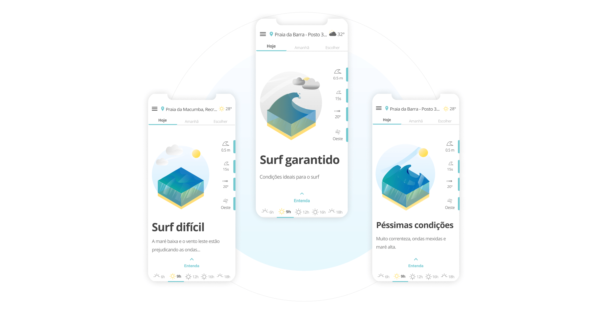
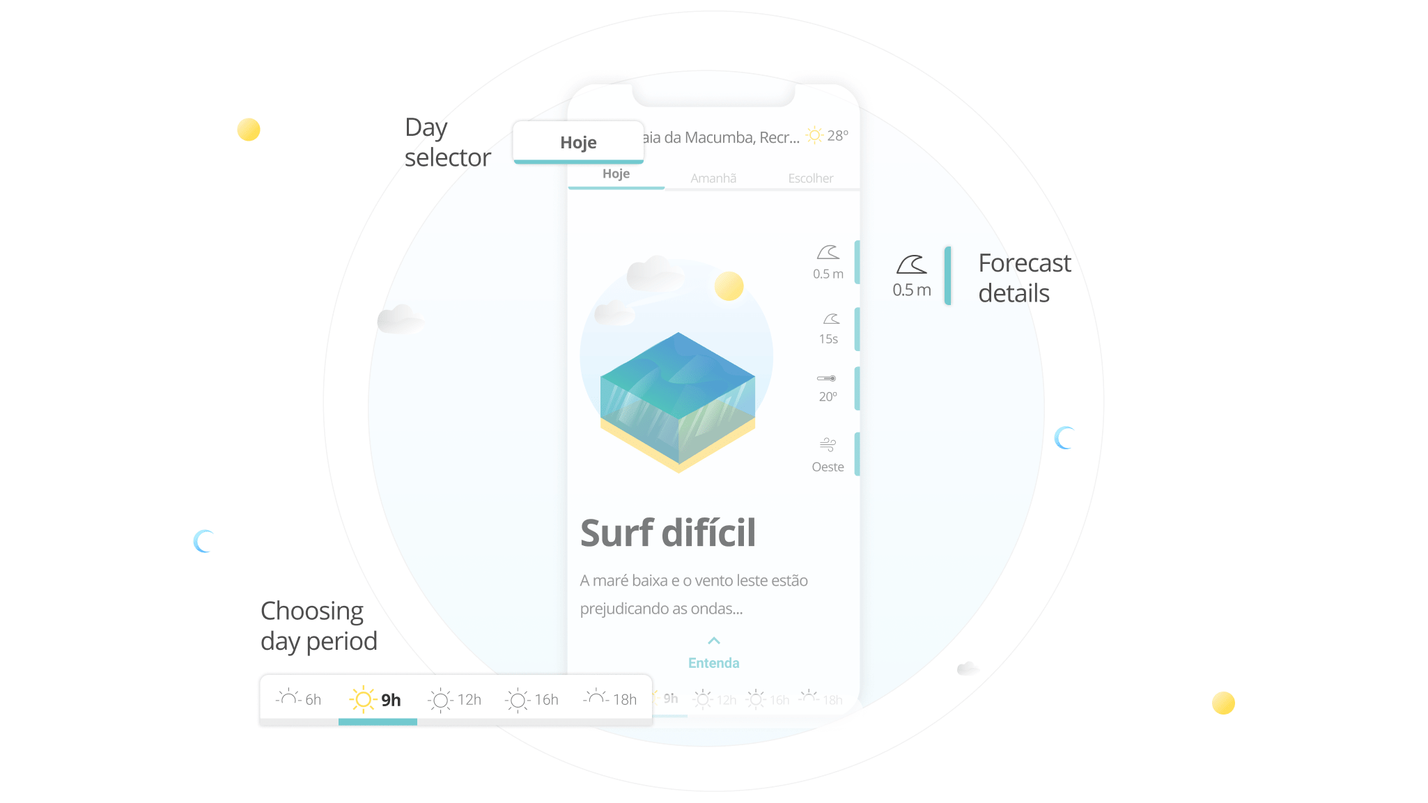
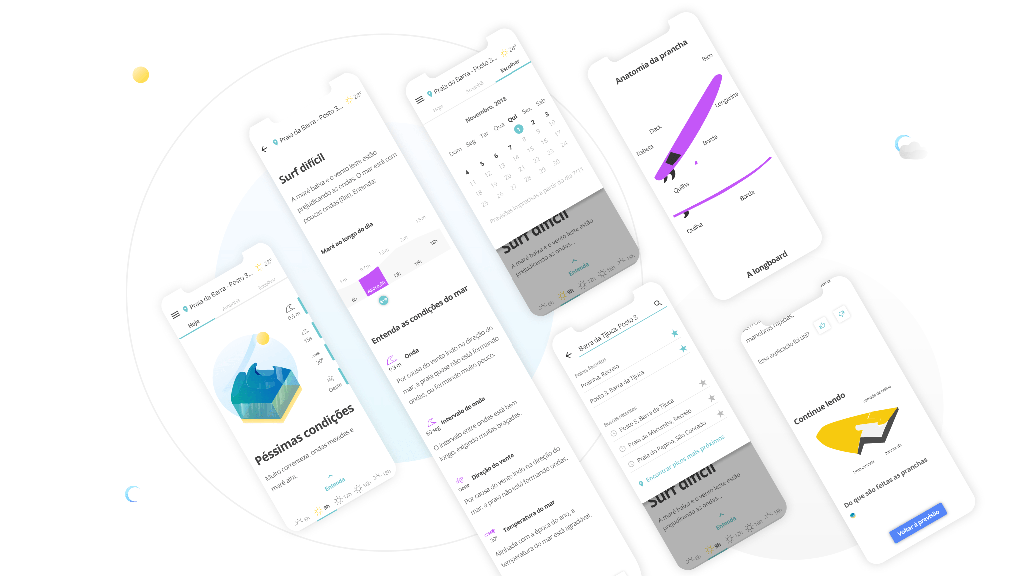
The biggest experience challenge was to make sure that the user wouldn't drown in information - as in the other forecasting visualizations. So, I developed a direct-to-the-point approach, with the option to go deeper into the data.
The macro visualization of the forecasting and the possibility to go to the micro.
Next steps
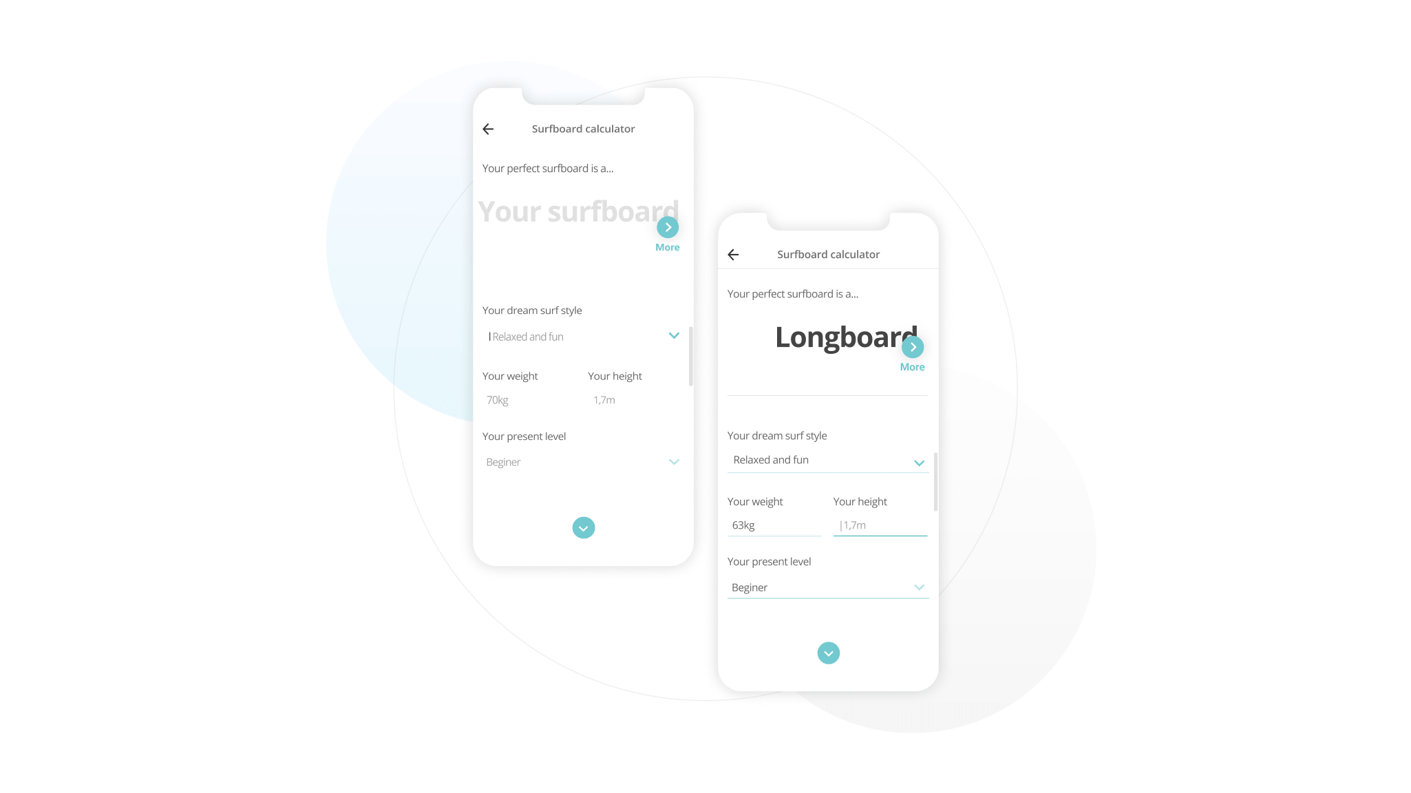
Far from the forecasting, we could offer lifestyle content as clothing tips and equipment. One example is this surfboard calculator concept that uses information about you to suggest the best surfboard model.
Surfsapp was conceived as a PWA. There was also the possibility to create a browser plugin to be where the surfer is.
Let's go further
You just read a shorter version of my project. If you want to hear more, say Hello 👽to me here.
Earthly greetings 👽