Termostatus
Scenario & summary
Brazil's continental dimensions and its highway based logistic system leads to danger to Brazilian health - cargos of refrigerated medicines can be lost by excessive hotness, humidity variations and inadequate exposure to light.
Law and regulation
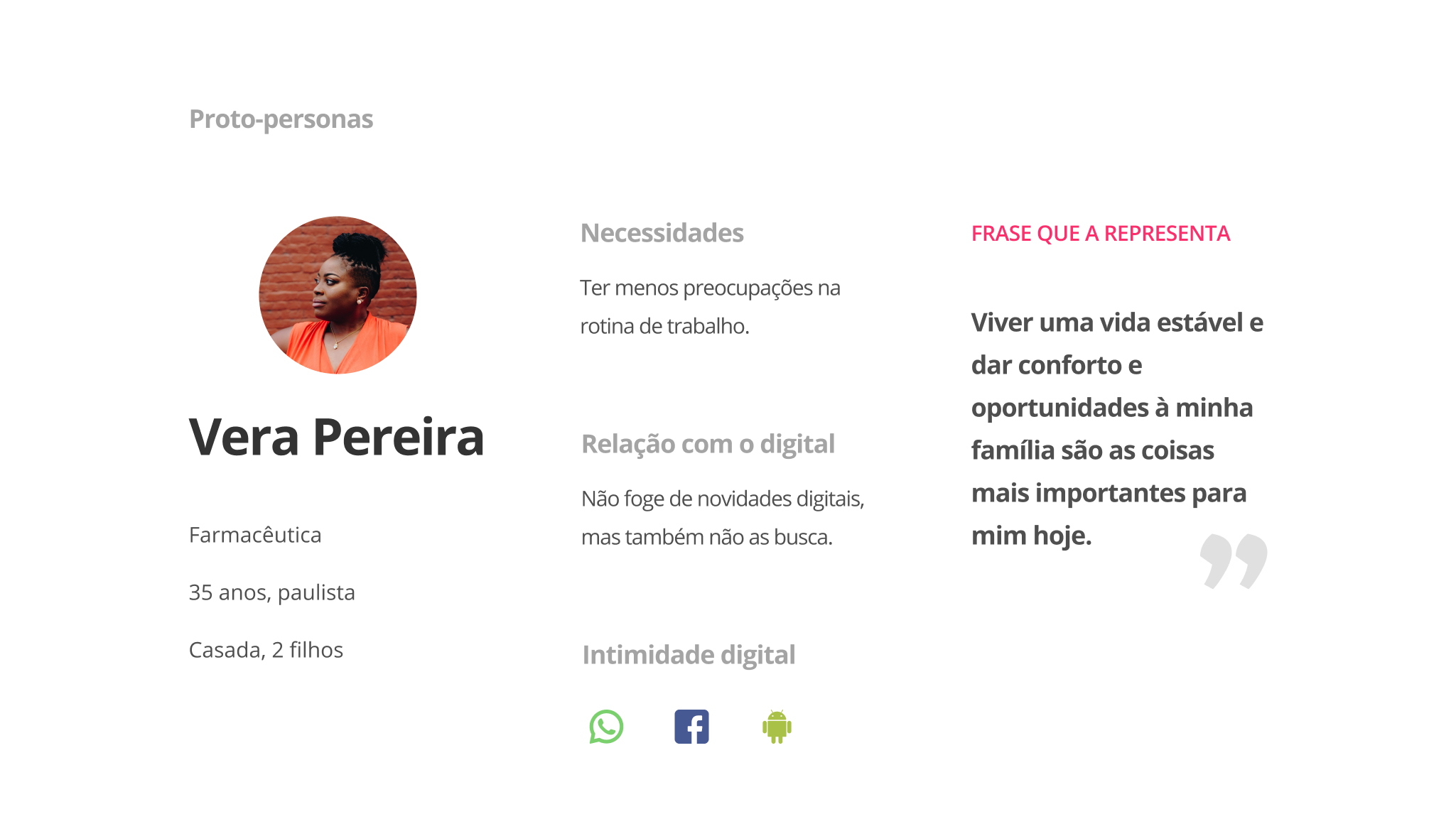
That's why Anvisa established that this system should have a periodic registration of the refrigeration conditions. This registering process is many times maintained by an employee responsible by noting them on a paper, from time to time - our proto-persona Vera. Automatizing this work means more productive work time to Vera and money saving for the industry.
Them, the human beings of the case
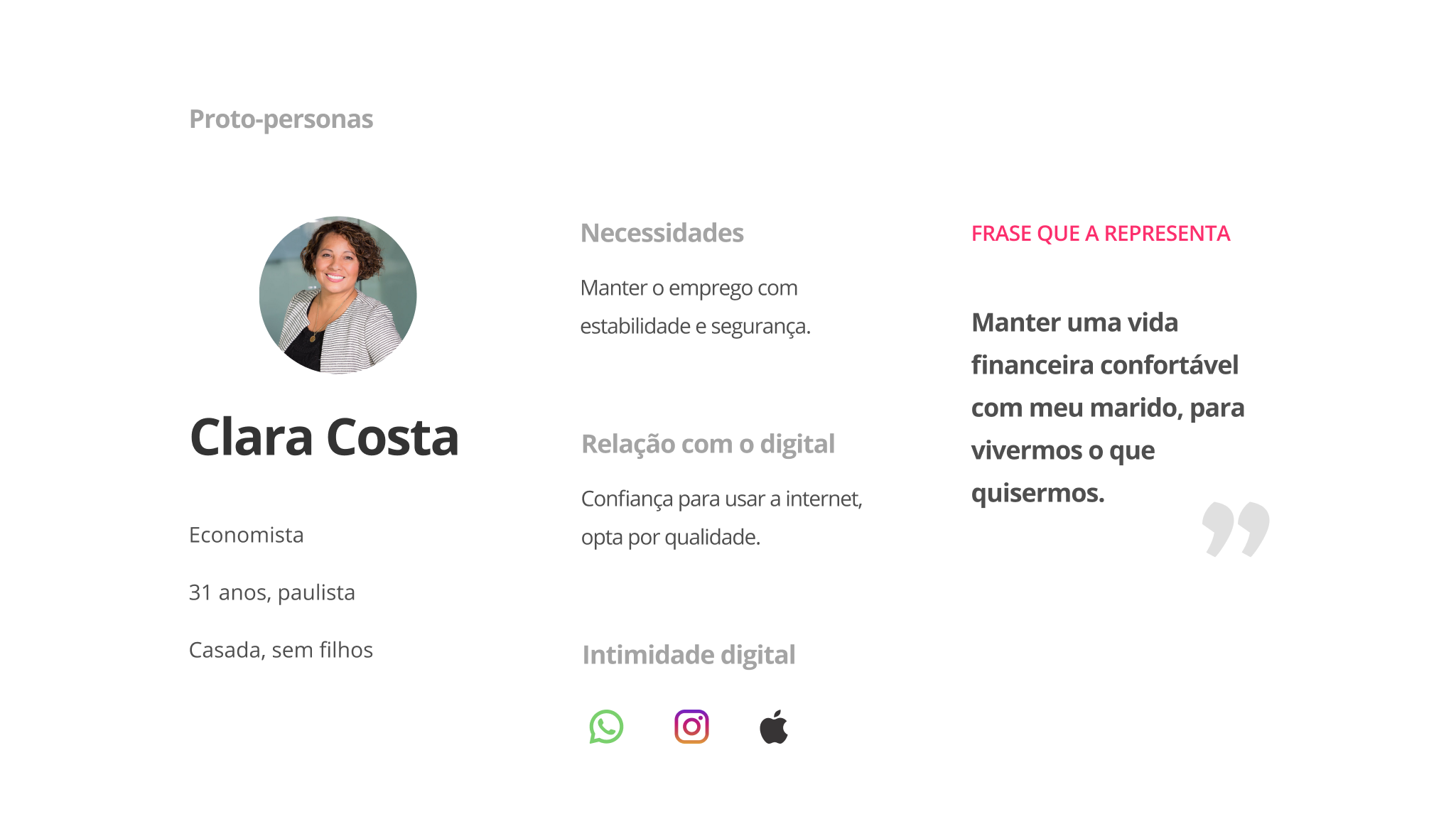
To keep in mind who would contract our SaaS and who would use it every day, I created two proto-personas: Vera, the responsible by checking the refrigerators during the day and Ana Clara, our buyer, a manager that doesn't want to risk her refrigerated products.
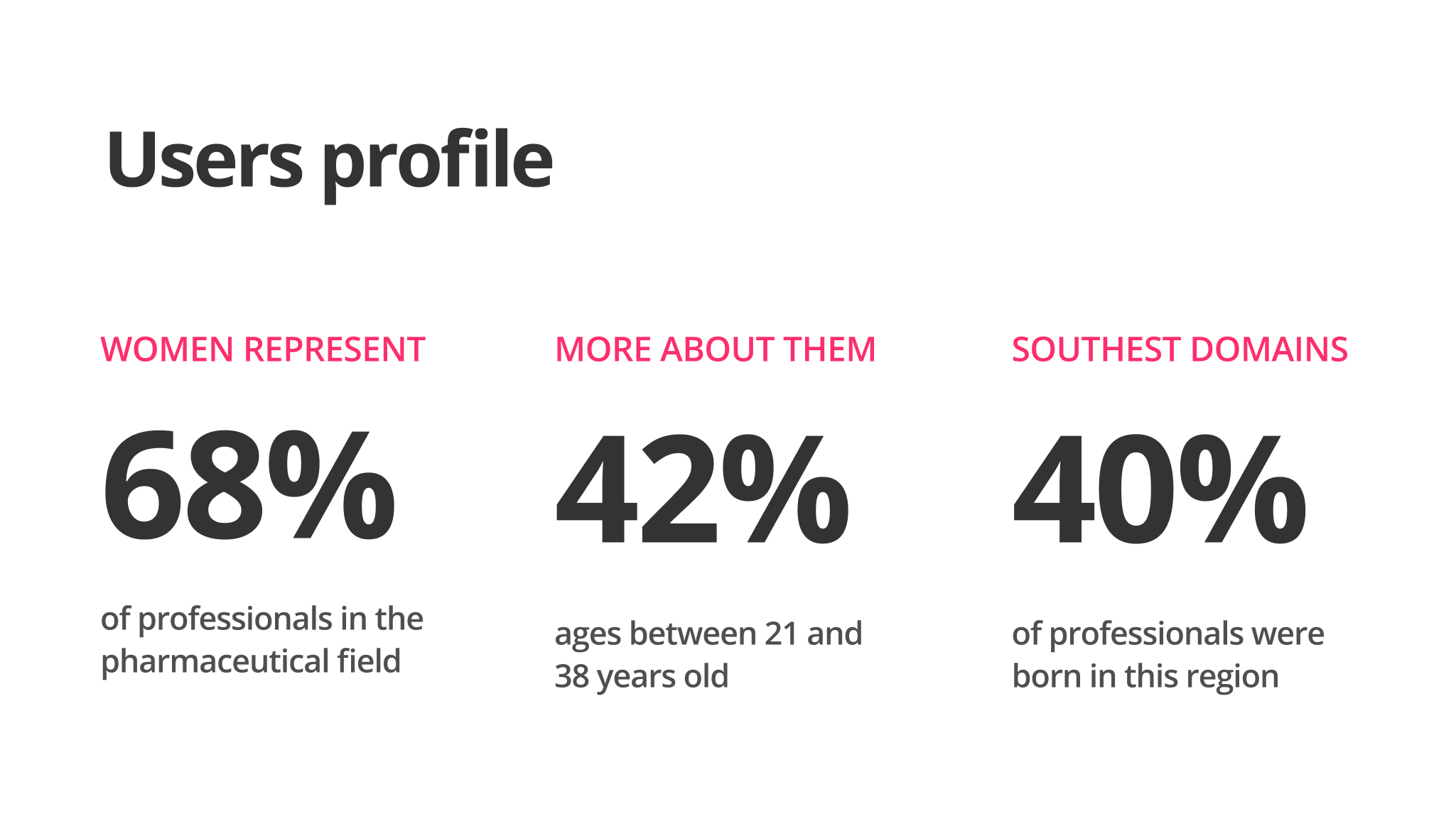
Target data collect online and proto-peronas based on it
Termostatus was created to make Vera and Ana Clara workday better and to ensure the quality of the Brazilian distribution of cold drugs.
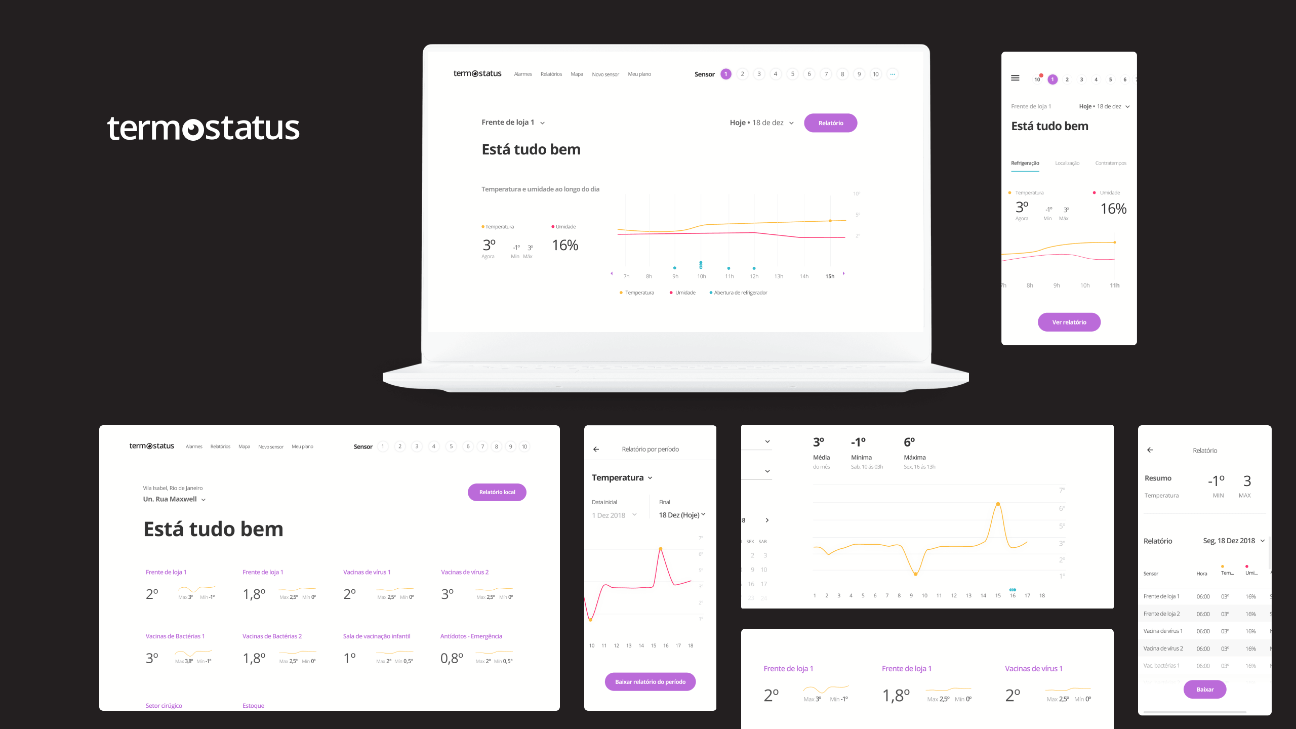
A sensor is born ⭐
We would offer an online service for monitoring temperature, humidity and light exposure based on IoT: a dispositive collect temperature data by refrigerator and generates automatically the reports demanded by Anvisa.
After mapping the problem, it was branding time
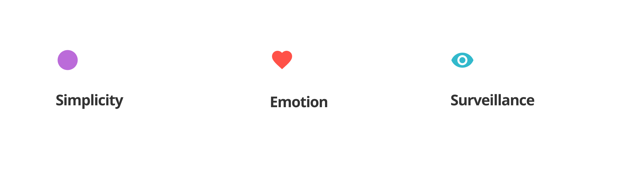
Once the problem and public were well established I moved to the question "how its gonna be the communication with someone who maybe feels replaceable?". Its was clear that the brand needed to be made for them and its first version was developed with three principles:
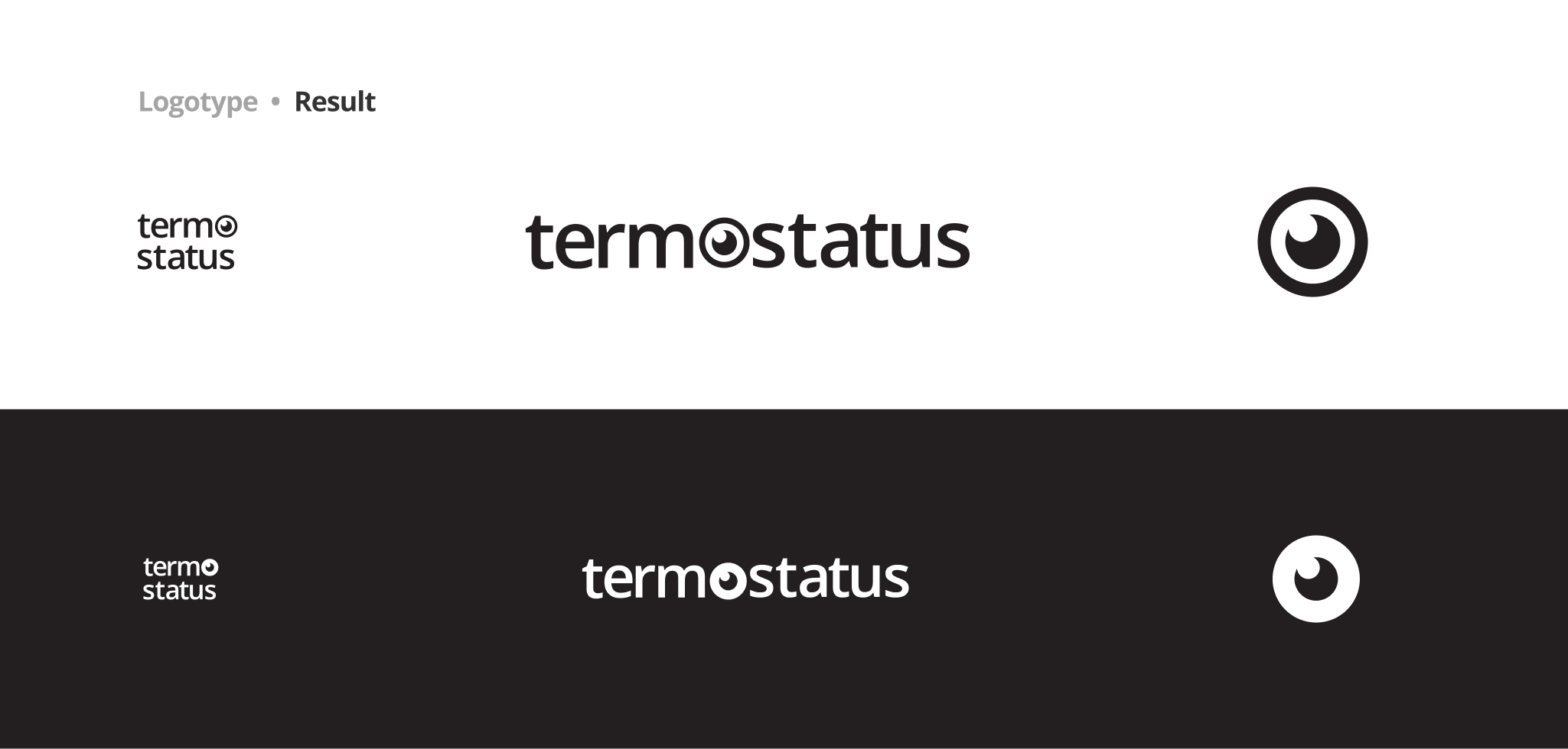
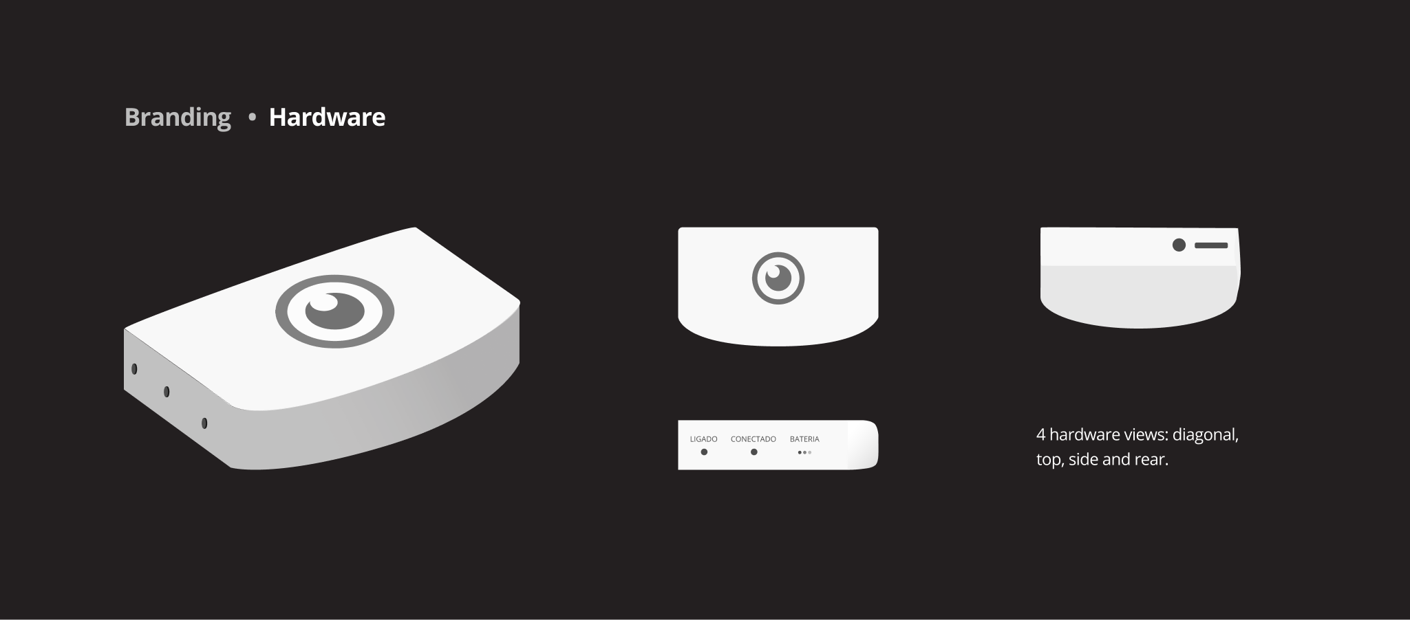
The logotype was developed with animistic characteristics and applied to the sensor's body, working and a face, a friendly little monster who took care of the temperature.
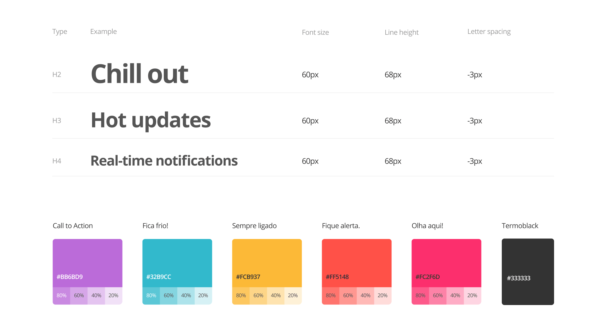
Whe had no brandbook. To keep consistence, all the communication assets should be done using the first version of the UI Style Guide - a embrion of and design system.
Organizing atoms
The brand should feel to our users like a character they interact with. I wanted the to feel connection and affection for Termostatus' hardware. Our logotype has animistic characteristics, to invite people to bound with it.
"Animism stimulates the same part of the brain that gets excited by cute cats and puppy love. [...] centers on our fantasy that technology can learn us, rather than our having to learn it."
David L. Rose at Enchanted Objects: Design, Human Desire, and the Internet of Things, 2015
The product itself
After the discovery of what could solve the problem and how the brand communicates I moved to discover the product possibilities. In the end, I bet on offering the possibility to watch the refrigerators' conditions per sensor. The focus was on the use cases:
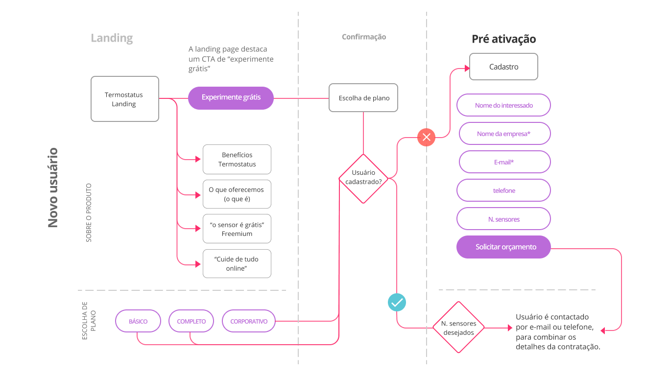
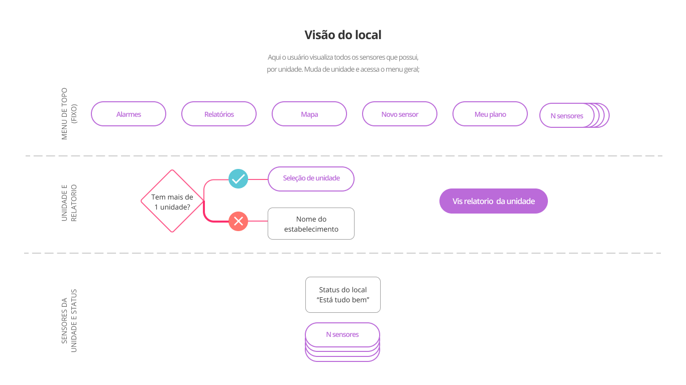
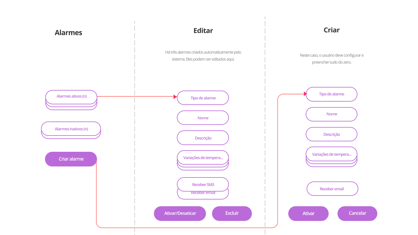
From left to right: sign-up flow, data visualization layers, and alarm settings.
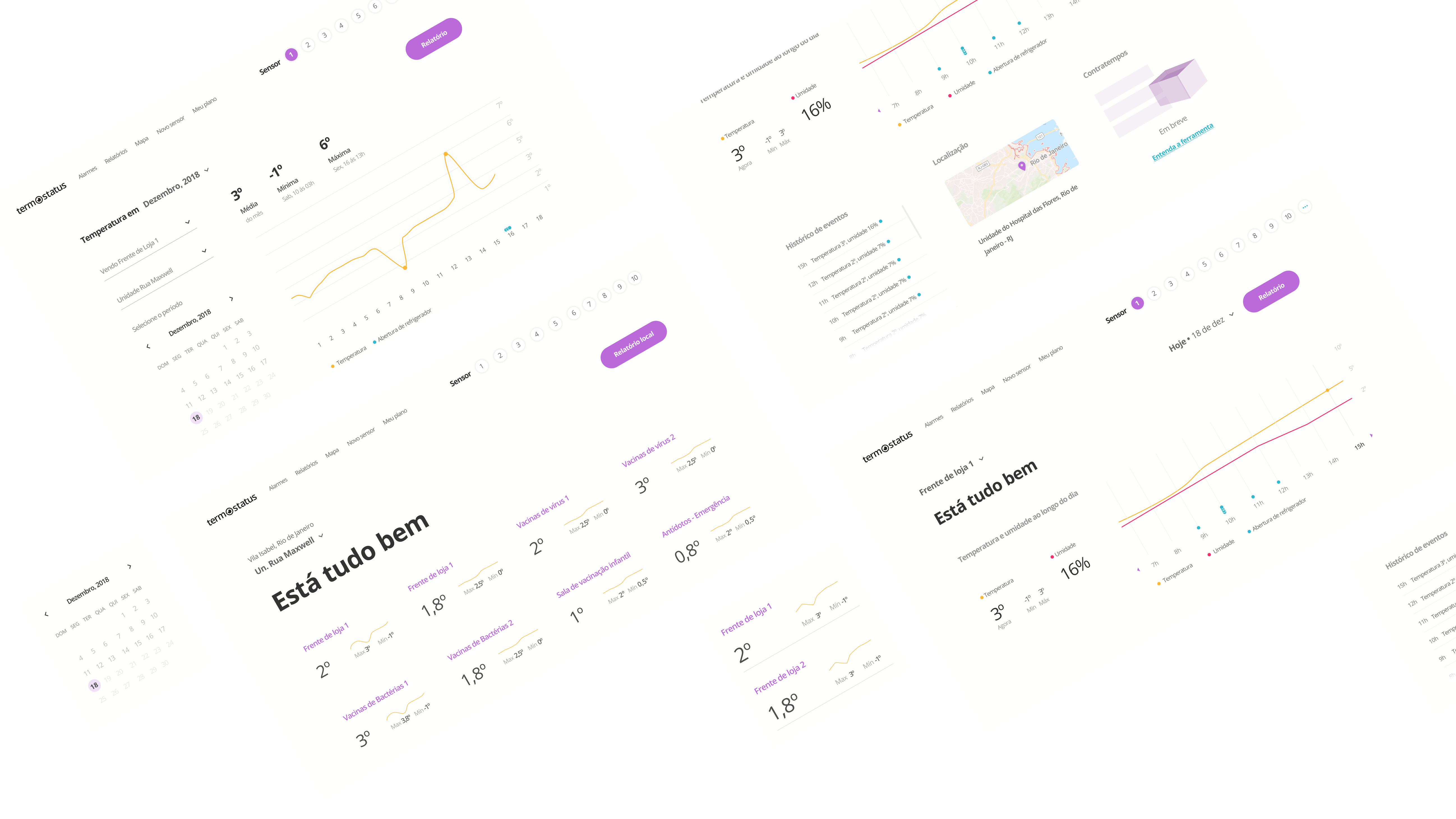
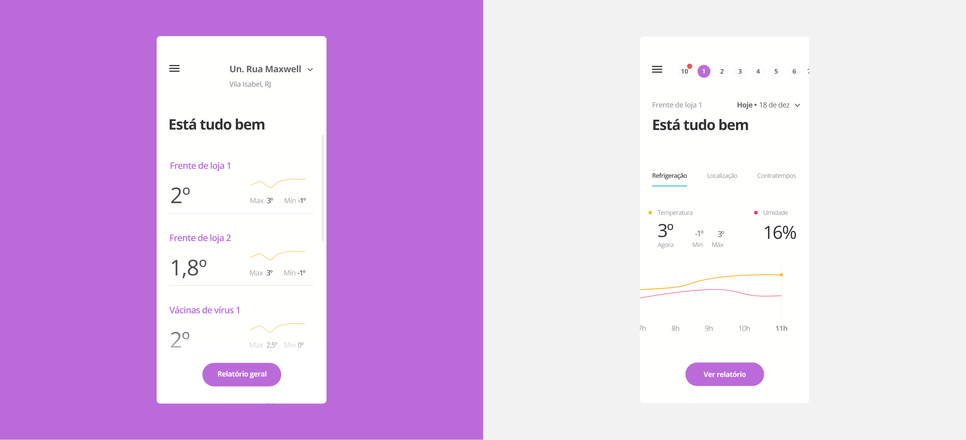
User interface
Mostly a status visualization, the interface was simple and straightforward. Its function is to inform the refrigerator status with elegance and simplicity.
Next step
Invalidate hypothesis applied to the business model, in the brand, and the interface by doing user interviews with pharmaceutics - the people who would interact with our service every day and with who contracts our service.
To the infinity and beyond
You just read and short version of the project story. If you want to know more, say "Hello" to me here. Ending transmission 👽